NEXRAD SITES WITH LAT/LON
Contents
NEXRAD SITES WITH LAT/LON
Author: Hamid Ali Syed | @hamidrixvi | syed44@purdue.edu
Import packages
import warnings
warnings.filterwarnings("ignore")
import datetime as dt
import matplotlib.pyplot as plt
import cartopy.crs as ccrs
import numpy as np
import pandas as pd
import seaborn as sns
import cartopy.crs as ccrs
import cartopy.feature as feat
from cartopy.mpl.gridliner import LONGITUDE_FORMATTER, LATITUDE_FORMATTER
from mpl_toolkits.axes_grid1 import make_axes_locatable
import matplotlib.patches as mpatches
import plotly.graph_objects as go
import glob
import os
The add_Map() function is to add coastlines, land, ocean, and state boundaries to the axes.
def add_Map(ax, b = 0, t=0, l = 0, r = 0):
    gl = ax.gridlines(crs=ccrs.PlateCarree(), linewidth=0.3, color='black', alpha=0.3,
                         linestyle='-', draw_labels=True)
    gl.xlabels_top = t
    gl.xlabels_bottom = b
    gl.ylabels_left = l
    gl.ylabels_right=r
    gl.xlines = True
    gl.ylines = True
    gl.xformatter = LONGITUDE_FORMATTER
    gl.yformatter = LATITUDE_FORMATTER
    ax.add_feature(feat.BORDERS, lw = 0.5)
    ax.add_feature(feat.LAND, lw = 0.3, fc = [0.9,0.9,0.9])
    ax.add_feature(feat.COASTLINE, lw = 0.5)
    ax.add_feature(feat.OCEAN, alpha = 0.5)
    ax.add_feature(feat.STATES.with_scale("10m"), alpha = 0.5, lw = 0.5)
Read NEXRAD data
df = pd.read_csv("nexrad_site_list.csv")
df
| ID | NAME | LAT | LON | |
|---|---|---|---|---|
| 0 | KVNX | VANCE AFB | 36.740617 | -98.127717 |
| 1 | PACG | SITKA | 56.852778 | -135.529167 |
| 2 | PAEC | NOME | 64.511389 | -165.295000 |
| 3 | TJUA | SAN JUAN | 18.115667 | -66.078167 |
| 4 | TJRV | JOSE APONTE DE LA TORR | 18.256000 | -65.637000 |
| ... | ... | ... | ... | ... |
| 207 | KOHX | NASHVILLE | 36.247222 | -86.562500 |
| 208 | KYUX | YUMA | 32.495281 | -114.656711 |
| 209 | RKSG | CAMP HUMPHREYS | 37.207569 | 127.285561 |
| 210 | TFLL | FT LAUDERDALE | 26.143056 | -80.343889 |
| 211 | KLGX | LANGLEY HILL NW WASHIN | 47.116944 | -124.106667 |
212 rows × 4 columns
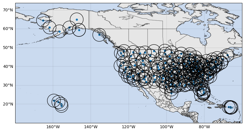
Plotting the data
fig = plt.figure(figsize = [10,6])
ax = plt.axes(projection = ccrs.PlateCarree((-91+-85)/2))
# ax.set_global()
ax.set_extent([-180, -60, 10, 60])
sns.scatterplot(data=df, x = "LON", y = "LAT", ax=ax, transform=ccrs.PlateCarree())


theta = np.linspace(0,359,10000)

for lat,lon in zip(df["LAT"],df['LON']):
    ax.add_patch(mpatches.Circle(xy=[lon, lat],
                                 radius=((200)*(np.pi/180)), # I have used 200 km here as random range
                                 facecolor='none',
                                 ec = "k",
                                 lw = 1,
                                 transform=ccrs.PlateCarree()))
add_Map(ax, b = 1, l = 1)
plt.show()
Let’s try plotly
fig = go.Figure(data=go.Scattergeo(
    lon = df['LON'],
    lat = df['LAT'],
    text = df['ID'],
    mode = 'markers',
    hovertext=df[["NAME", "ID"]],
    marker=dict(
        color='rgba(0,0,0,0)',
            size=50,
            opacity=0.5,
            line=dict(
                color='MediumPurple',
                width=2,
            )

)))


fig.update_geos(
    resolution=50,
    showcountries=True, countrycolor="RebeccaPurple",
    showsubunits=True, subunitcolor="Blue"
    )

fig.update_layout(
    title = 'NEXRAD SITES (Hover to see Name & ID)',
    geo_scope='usa',
    mapbox_style="white-bg",
    mapbox_layers=[
        {
            "below": 'traces',
            "sourcetype": "raster",
            "sourceattribution": "United States Geological Survey",
            "source": [
                "https://basemap.nationalmap.gov/arcgis/rest/services/USGSImageryOnly/MapServer/tile/{z}/{y}/{x}"
            ]
        }
      ])
# fig.update_layout(margin={"r":0,"t":40,"l":0,"b":0})
fig.show()